
library, part 05: painting the room
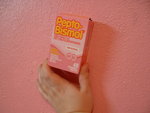
04.08 we opted not to paint the room with an over-the-counter medication
 click to see the full photo gallery[NOTE: this project was done in conjunction with the guest room & studio project.]
When we first saw the house, we did not realize this room was pink. Of course you're saying to yourself, "How is that even possible? Were you under the influence of psychotropic drugs? You'd have to be to miss that color." All we can say is that love makes you blind. Although in our defense, there were so many pictures and hangings covering the walls from floor to ceiling that it was difficult to see much of the walls themselves.
So you can imagine our startlement when we moved in and saw the emptied room for the first time. In fact, I think Sal even said, "Ugh, I have a stomach ache." ::rimshot::
Doing something about it was going to have to wait, though. We had too many other projects that were more pressing and we had to use the room for storage until a few other projects were finished first. Nonetheless, no room elicited more of a response from visitors than that color, not the hopelessly outdated kitchen, not the partially-demolished bathroom, not the bizarre porch-posts-slash-birds'-nests. One look at those walls, and the reaction was inevitably some variation of, "Egad! Who vomited Pepto Bismol in here?"
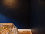
Just getting the primer on the walls was a huge improvement. (We used a gray-tinted primer because the wall color we chose was so dark.) In fact, with the white-primed trim, the gray looked quite sophisticated and I remember we briefly joked about stopping there. Only briefly. The color we chose was too beautiful not to use.
The inspiration for the wall color came from a seemingly unlikely place: a DVD box. More precisely, the Lord of the Rings Platinum Series Collector's Extended Edition DVD box. It's a beautiful midnight blue color that we knew was the perfect color for our library. Unfortunately, we couldn't find a blue that was close enough at the paint store. Thank goodness for custom-mixed paint colors! The guy at Miller Paint didn't even laugh when I whipped out the DVD box and showed him the exact color we wanted. And he then proceeded to mix it right there, perfect on the first try.
But the really cool part? Miller Paint has a preferred customer program that gives you a nice discount but the real feature of the program is that they keep track of your paint colors for each of your projects, so if you ever need that paint color again -- you need to patch a hole in a wall, say -- they can look up the exact color and sheen AND the exact mixing ratios so even if the color is discontinued, they can still mix it. Well, since this was a custom color, I got to pick a name for it to be saved under in our database file. Good thing I was prepared, because we had already decided what we were going to call it: Gondorian Blue. I KNOW RIGHT.
For the hallway, we chose the same dark yellow/gold color as we used on the living room accent wall, which was actually a Sherwin-Williams color called Bakelite Gold. Luckily, Miller had a perfect match called Impulse. For the trim, doors, and windows, in the hallway and library and stair landing, we used the same Coconut Milk color we used in the guest room and closet, as well as in the attic and attic stairwell.
 click to see full photo galleryWe were fortunate to once again have the help of Guy and Sister for a weekend of painting (and of course the Fabulous Miss M for fun distraction!), as well as help from ProcrastiGirl, so we managed to get all the priming and wall/ceiling painting done in a single weekend, and most of the trim painting done (with the exception of the doors, which were done as a separate project in the summer). The touch-up painting (where the paint bled through the masking tape) took quite a bit of time, especially in the library, but we finished all the painting much faster than we would have without all their help.
And in the end, we had a room that didn't remind us of a stomach ache.